Communication Designer
Langoor Rewritten:
A type-led identity for Langoor Digital
Project Type
Brand Strategy | Type-led Identity | Typeface Design

about the project
inside langoor
This project reimagines Langoor Digital’s identity by placing type at its core. Inspired by the bold character of the existing logo, a custom display typeface was developed to reflect the brand’s innovative and unconventional spirit. The new visual system builds consistency without losing the edge that defines Langoor.
Langoor is a pioneer in AI-led marketing. Over the past 10 years, the agency has led the way in combining AI and creativity, offering services across Tech, UI/UX, Graphics, and more. It stands apart for its innovative approach and expertise in leveraging AI to create impactful marketing solutions.
They believe in thinking differently and bringing a touch of “craziness” to their work, aligning with their name "Langoor".
"you need to be crazy to change the world"
why to Rewrite
Despite being a leader in AI-led marketing, Langoor Digital lacked a cohesive visual identity. The absence of clear type guidelines, a defined visual system, and consistent design language made brand communication fragmented across platforms which diluted its bold, innovative voice.
* Visual language is inconsistent across all social platforms.
* No distinctive identity that defines Langoor as an agency across different platforms.


* Effectively represents the brand's identity, reflecting a blend of creativity and technology.
* The font's uniqueness ensures the logo is easily recognizable, building a strong brand recall.

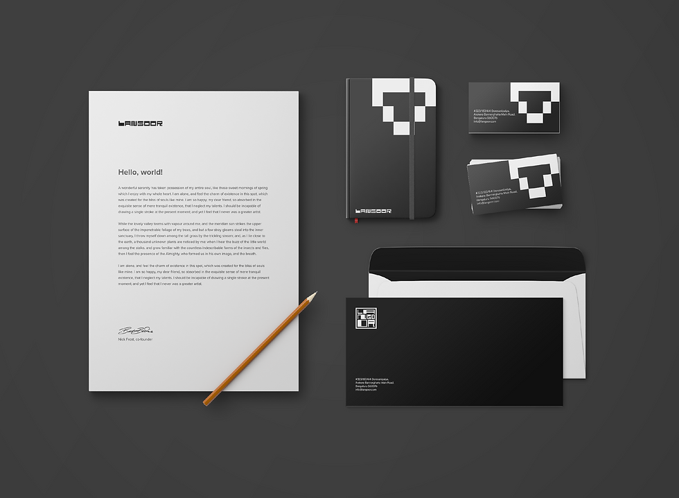
* Color Palette: No defined secondary color palette.
* Typography: No defined guideline on custom or chosen brand font.
* Layout: No defined Layout design guidelines.
the gap
the strength
* Follows a bold and contrasting primary color palette of Black and white which conveys the bold and innovative values.

The final design approach focuses on building a cohesive, type-led brand identity for Langoor Digital by drawing inspiration from its existing logo. The distinctive character and boldness of the logotype is served as the foundation for developing a custom display typeface that reflects the agency’s core values — innovation, clarity, and forward thinking.
design direction
decoding typeface


final typeface


Pattern Design

Langoor
rewritten
-26.png)
color palette
-27.png)
type hierarchy
-28-28.png)
brand asset
-29.png)
photography approach
-30.png)
photography approach